Showing posts with label Corporate Identity. Show all posts

4.10.20

The Difference Between Brand, Brand Identity, and Branding.


If you took a guess, what brand comes to mind first from the image above? You probably guessed it. Coca Cola. Their brand is one of the largest, most iconic brands in the world and they can be easily recognized from just a simple letter. So let’s talk branding.

Your brand and your visual identity are both critical to your business but they are two different things and both terms have been used loosely in the past years in terms of what they stand for.

These are some of the most common ways project requests that come our way start with:

“We need to update our brand”

“We need to update our brand identity”

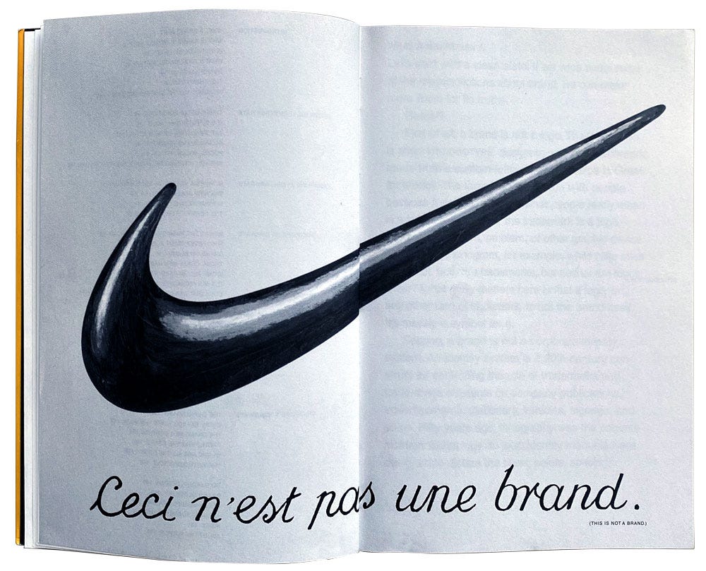
Most often, after a brief chat to understand the project at hand, typically they are referring to their logo or website. However, your logo and website is not your brand.‍

Defining “Brand”.

In the simplest form, your brand is the way someone feels about you. A deep down gut feeling. It is the emotional connection your customer has towards you. Every time your customer interacts with your brand, they build up a perception of how they feel and think about you as a business. If you think about your last experience with any brand that was negative, do you trust them as much anymore? Probably not. Over time, your customers will create a set of expectations on how each experience with you should be, and how they feel about you. Those thoughts and memories are what builds long term trust and loyalty. That’s what you want. That’s gold.

Image for post
The Brand Gap by Marty Neumeier

Your brand has three primary functions:

1. It Builds Trust

The more trust you build, the more loyal your customers become. You become irreplaceable in their eyes and there is an unbreakable connection between you and your customer. They will choose you over a competitor.

2. It Creates Distinction

You should stand apart from your competition, not blend in. The more distinctive you are from everyone else, the more noticeable you become.

3. It Increases Value

From a service, product, and a business you become more valuable. Additionally ー if your products or services are meant to be luxury, and you do not exude that feeling as a brand people will be hesitant to pay that higher price point. They will not see the value. Take Peloton for example; when they raised their bike prices they actually sold more bikes. Many people believed that because the bike was cheaper that it must not be a quality machine.

Peloton is also a great example of building a valuable brand over time. They empower people to connect, be inspired, and grow stronger together. They are the leader in their segment and while their products are expensive, they have built trust and differentiated themselves from others in a way people believe in and connect with, which has fueled their success. After only launching in 2012 they are now worth 4 billion dollars.

Defining “Brand Identity”

Your identity is all of the different touchpoints someone may interact with your business. It is an entire system put together that people can see, touch, hear and feel. This is everything from your logo to emails, customer services, and even the way you speak to people. This is how you influence the perception of your brand. Changing how people think about you, can change their behavior, which will increase your bottom line performance.

Image for post
Brand Identity Touchpoints

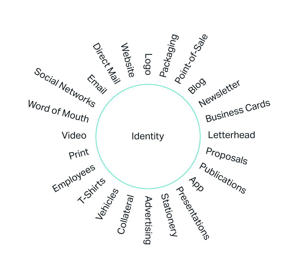
Your logo is only one piece of the puzzle, and while most often it’s the first step when creating your identity, it is not the last. A good logo surrounded by a frustrating website experience, un-unified collateral and marketing is a recipe for failure. Every touchpoint matters.

Your identity has three primary functions:

1. Identify Your Business

The visual look and feel that your company encompasses should separate you from the competition. Over time, your customers can immediately look at something and have a sense of feeling for that brand.

2. Communicate Your Message Clearly

It should communicate to the desired customer you are trying to attract. This is key. Your identity cannot always speak to everyone. Some brands target the average individual looking to stay fit, other brands target suburban moms who want to learn how to cook authentic asian cuisines. By understanding who is your ideal customer profile you can design for them, not for yourself.

3. Create Visual Consistency

Your identity takes separate elements, and makes them whole by staying consistent through design and messaging. Every part of your brand should be consistent. The moment something is different from the rest, you risk mis-communicating to your audience. This breaks trust.

The Branding Process

Branding is the ongoing process of developing, or re-developing your overall strategy and touchpoints within your identity. This could be redeveloping your website, logo, collateral, messaging and your color system. It’s an investment that can help position you for success and growth. There’s several key reasons when the process of branding is necessary.

New Company or Product

  • You have started a new business, or have a new product
  • You need to raise venture capital, even though you have no customers

Revitalization

  • You need a facelift
  • Your product or service is great, but you look behind the times
  • Your packaging is not distinctive

Consistency

  • Everyone creates and does their own marketing
  • All of your marketing looks like it comes from different companies and you lack consistency

Reposition

  • You are not attracting your desired customers
  • You want to appeal to a new customers
  • Nobody knows who you are
  • You need to communicate more clearly who you are

Name Change

  • Your name no longer fits the business you are in
  • Your name needs change due to trademark conflicts
  • Your name misleads customers‍

You have Merged

  • Two companies have merged into one
  • You need a new name
  • You want to build on the equity of one brand

Starting the Branding Process

The branding process is essential for any business that wishes to differentiate and get ahead of their competition. It’s also a process you shouldn’t rush. While the investment is long term, it can pay off in growth of your business. The overall process consists of four systematic stages that vary from business to business.

Strategy

This gathers all necessary information from research to organized brand strategy workshops.

Design

The development of all visuals and assets

Implementation

The rollout of the new visual identity

Build

Adapt and pivot where necessary and grow your brand over time.

Why Branding is Worth The Investment

In the end, the long term rewards of the branding process building trust, distinction and value pay off big. It creates years of competitiveness for your business. However, in today’s business world everything moves at lightning speed. That makes it easy to get caught into quick fixes such as a fast logo or website redesign on websites such as Fiverr and UpWork which can be risky. The strategy and development process typically takes several weeks to a few months depending on the scale of the project at hand. Rushing this process will not provide the results you are looking for.

                                         ***

Free Branding Workbook

Want to try yourself? We’ve put together a free brand strategy workbook. While it’s not the same as professionally run workshops, it’s a great foundation for you to work from.

Download The Workbook

The Startup

Medium's largest active publication, followed by +711K people. Follow to join our community.

29.9.10

Mission Possible: LOGO/ Identity relevance

Nordkyn Logo, New
Two municipalities — Gamvik and Lebesby — have come together to promote tourism to the peninsula and worked with Oslo-based Neue Design Studio to create an identity that, literally, reflects the nature of this destination: Visit Nordkyn.

The visual identity is based on two main ingredients; our newly developed payoff, "Where nature rules," and weather statistics from the Norwegian Meteorological Institute. A feed of weather statistics affects the logo to change when the direction of the wind or the temperature changes. On the website, the logo updates every five minutes. We developed a logo generator where Visit Nordkyn can download their logo to the exact weather conditions of that particular moment. Nordkyn is truly a place where nature rules, even over the visual identity.
Nordkyn
Structure of the changing icon.

Nordkyn

Colors cover a range of temperature from -25°C (-13°F) to 25°C (77°F).

Animation showing the logo changing direction and colors.
Nordkyn
Sample iterations of the logo. Click image for bigger view.
Nordkyn
The icon itself is deceivingly simple, with a single point that stretches in the direction the wind blows, giving it the appearance of extensive flexibility that, when paired with the muted rainbow of colors, makes it feel infinitely mutable. The typography goes almost unnoticed but provides just enough personality to make the logo feel scientific and official.


Nordkyn
Stationery.
Nordkyn
Nordkyn
Business card.
Nordkyn
Nordkyn
Nordkyn


28.2.10

Sony| Company ethos | Make.Believe

Director Noam Murro throws everything into this epic 90-second cinema spot that takes us through the four worlds of Sony: electronics, music, film and games.

.

The initiative includes a 90 second heavy FX film running in cinemas nation-wide in the USA. The epic-style, humanistic film shows a boy taking a journey through four Sony worlds (electronics, music, film and games) by pushing buttons. The boy falls into a Sony electronics lab, lands in the movie 2012, must dodge racing cars in Sony Playstation’s MotorStorm Pacific Rift game, then ends up on stage with Sony’s new up-and-coming band Hey Monday. The boy represents childlike wonder and the belief in yourself that you can make imagination real. The film was directed by award-winning Director Noam Murro, whose body of work represents the epic nature that was achieved in the film. Animal Logic handled visual effects creation.

Advertising Agency: 180LA, USA
Executive Creative Director: William Gelner
Creative directors: Gavin Milner, Grant Holland
Executive Producer/Managing Partner: Peter Cline
Senior Producer: Tony Stearns
Account Director: Katrin Tenhaaf
Account Executive: Jacob Gentry
Copywriter for brand line “make.believe”: Lee Hemstock, Dario Nucci

12.2.10

Design Evolution of 40 Famous Corporate Logos


Volkswagen

Evolution and History of 40 Corporate Logos
The first Volkswagen logo was designed by Franz Xavier Reimspiess, a Porsche employee during an office logo design competition. The core of the logo hasn’t changed much, but understandably after the WWII, they dropped the design around the circle which seems to be inspired from the Nazi flag. The fresh colors that were added to the logo in 2000, which depicts a positive change in the company and the ability to adapt to the new millennium.
Volkswagen Home »

Shell

Evolution and History of 40 Corporate Logos
Back in 1900, when Shell was launched the logo was a realistic and simple shell which lies flat on the ground. The evolution of the logo began after 1915, when rendering enabled the company to reproduce its identity easily. This is visible in the 1930 logo for the company. It added the red and yellow colors to the symbol, which are the colors from the Spanish flag where many Californians originated from, which might have helped the company to create an emotional bond with the people.
With the advent of internet and fax machines over the later years it became necessary for the company to simplify their logo. The 1971 logo designed by Raymond Loewy is very simple as compared to the earlier logos making it more memorable and recognizable.
Shell Home »

Master Card

Evolution and History of 40 Corporate Logos
In 1966, seventeen bankers formed a federation for the reciprocal acceptance of their credit cards – called Interbank. The ‘i’ was used to identify the participating members of the Interbank Card Association.
In 1969, the name was changed to Master Charge. The new logo had the two familiar intersecting circles with the ‘i’ being retained at the bottom to show continuity and also to make it easy for people to recognize their earlier familiar logo.
Finally, in 1979, the name MasterCard was adopted and the ‘i’ was finally dropped from the logo. In 1990, bold colors were introduced which also made it easier to recognize the 23 horizontal bars between the two circles. As a result the logo looks more contemporary and simple, with an italic, sans-serif typeface.
In 1996, with further tweaking, Master Cards visibility, recognition, and overall brand image has greatly improved, with new features including larger lettering highlighted with a drop shadow, fewer interlocking bars within the red and yellow circles, and a new dark blue background for use on decals and signage.
Master Card Home »

Alfa Romeo

Evolution and History of 40 Corporate Logos
Alfa Romeo’s distinctive logo was created in 1910 by a draftsman named Romano Cattaneo. One day, while waiting for a tram at the Piazza Castello station in Milan, he was inspired by the red cross in the Milan Flag and the Coat of Arms of the noble House of Visconti, which featured a biscione (grass snake) with a man in its jaws, symbolizing “Visconti’s enemies that the snake [was] always ready to destroy.” (Source) Two Savoia dynasty knots separated the words ALFA and MILANO.
The Romeo part arrived in 1916 when Neapolitan businessman Nicola Romeo bought the company and converted its factories to produce munitions and machineries for World War I. After the war, the company went back to producing cars and took on its owner’s last name to become Alfa Romeo.
Alfa Romeo Home »

General Electric G.E.

Evolution and History of 40 Corporate Logos
The basic logo font face is still quite similar to what it was in 1892. Over time, a circle engulfing the company name has been added to the logo, which might be due to the increasing global presence and vision of the company. The current logo, which was designed by Wolff Olins, adds blue color to the logo instead of the black which had been used in all the previous logos. Accompanied with the logo change was also a change in the tagline of the company from “We bring good things to life” to “Imagination at work”.
General Electric Home »

Saab

Evolution and History of 40 Corporate Logos
The griffen logo, featuring the head of a mythological beast that had a body of a lion and head and wings of an eagle, came from Vadis-Scania, a truck manufacturer that merged with the SAAB (airplane) company. The griffen was used as a coat of arms from the province Scania.
In 2000, Saab Automobile company was bought out by General Motors, and thus no longer had any connection with SAAB outside of its history and logo similarities.
Saab Home »

Nike

Evolution and History of 40 Corporate Logos
Nike probably got the best deal amongst all companies when Caroline Davidson designed its logo for just $35 in 1971. The main part of the logo hasn’t really changed with time. They waited 7 years before finally improving the logo by no longer having the text and the swoosh overlapping each other.
As the brand gained recognition, the company name was dropped from the logo, which made it more simplistic and memorable. The company has different variations of this logo for its various departments like Skate, Soccer etc.
Nike Home »

Mazda

Evolution and History of 40 Corporate Logos
In the 1936 logo, the M shaped curve was inspired by the emblem of Hiroshima city. The 1991 and 1992 logos symbolized a wing, the Sun and a circle of light. Mazda’s current logo, nicknamed the “owl” logo, was designed by Rei Yoshimara in 1997. The stylized “M” was meant to look like stretched wings, but many people saw a stylized tulip instead.
Mazda Home »

Yamaha

Evolution and History of 40 Corporate Logos
The three tuning forks of the Yamaha logo mark represent the cooperative relationship that links the three pillars of there business — technology, production, and sales. They also evoke the robust vitality that has forged a reputation for sound and music the world over, a territory indicated by the enclosing circle. The mark also symbolizes the three essential musical elements: melody, harmony, and rhythm.
Yamaha Home »

BBC

Evolution and History of 40 Corporate Logos
BBCs first attempt at branding came in 1953 when Abram Games was commissioned to design the BBC’s on-screen identity. He was famous at the time for designing the logo for The Festival of Britain of 1951.
His Television Symbol was a brass model whose centre circles could rotate. For BBC Scotland the spot in the middle was replaced by a lion. There were also other regional variations as well as a matching clock.
This new “bat wings” logo replaced the BBC coat of arms on screen, and would be seen before almost every programme.
BBC Home »

Mercedes Benz

Evolution and History of 40 Corporate Logos
In 1902, the logo for Mercedes was nothing more than the simple company name. However, it was changed to a 3 pointed star in 1909. The origin of this star came from a postcard by Diamler, where he had drawn a 3 pointed star which represented ‘making vehicles in land water and sky’.
After 1926, a new symbol for Mercedes-Benz came into picture, where the original logo of both the companies was merged into one. It combined the 3 pointed star of Mercedes and the laurel wreath of Benz.
Mercedes Benz Home »

Kodak

Evolution and History of 40 Corporate Logos
Interestingly, Kodak was the first company to integrate its name and looks into one symbol in 1907. After 1935, Kodak predominantly used yellow and red colors and the complete name of the company. First time the Kodak name was completely written in the logo in 1935, which began the use of yellow and red colors as well.
In 1960, they tried to show a flip page as a logo, but was changed to a box and graphic “K” element in 1971. Retaining the 1971 concept, there was a slight variation in the font in 1987 giving the logo a more contemporary look and feel.
Again, like most companies, Kodak decided to simplify their logo in 1996, and removed the boxes. The red color gives a more brighter and structured feel of the company. In 2006, again a slight variation was made in the logo with a rounded ‘a’ and ‘d’.
Kodak Home »

Nokia

Evolution and History of 40 Corporate Logos
‘Nokia’ in Finnish means means a dark, furry animal we now call the Pine Marten weasel. However, this has little to do with the current business and brand image. The origin of the company name, can rather be attributed to the setting up of the wood pulp mill (set up by Knut Fredrik Idestam), on the banks of Nokianvirta river in the town of Nokia.
The Nokia Corporation was formed as a merger of Finnish Rubber Works (which also used a Nokia brand), the Nokia Wood Mill, and the Finnish Cable Works in 1967. The company has sold a variety of products in the past including television, shoes, car tires and others. The evolution and the meaning of the logo is unclear due to the changing business over the years.
Nokia Home »

SONY

Evolution and History of 40 Corporate Logos
The first version of the SONY logo, which was enclosed in a square box, was registered as a trademark in 1955. Thereafter, the logo went through a succession of changes. In the 1960s, when Sony began to seriously develop its brand image overseas, the logo was displayed in neon in New York and Hong Kong, where it competed with famous and well-established foreign companies. In 1959, the catchphrase “Sony — a worldwide brand born in Japan” was introduced to capitalize on the logo. This was followed by the slogan, “Research Makes the Difference.”
To develop an even more effective logo, a committee was formed within Norio Ohga’s Design Division. By 1962, corporate identity (CI) rules and a design policy for the use of the Sony logo were established. After making numerous attempts to modify the logo, the company decided on the current version, which was introduced in 1973.
In order to mark the 35th anniversary of the company in 1981, there was a proposal within Sony to introduce a new logo. Although ideas were submitted from all over the world, Ibuka decided that none of the designs was better than the original one which had been in use since 1973. Consequently, the 1973 logo was kept, and it is still in use today.
Sony Home »

REUTERS

Evolution and History of 40 Corporate LogosThe rounded piece – or roundel – was developed in 1996 as an icon to increase Reuters visibility on computer and TV monitors, and as a way to brand the company’s on-screen services using far less space.
As originally conceived, the roundel was intended to resemble an abstract globe, representing not only the worldwide nature of Reuters business, but also the continuous collection, processing and distribution of information, 24 hours a day (with the dots representing information, and the two hemispheres of the globe representing day and night). Moreover, the left side of the roundel was meant to refer to the openness and transparency of the company; a visual way of portraying Reuters integrity.
But in 1999 the dots in the name were joined to create greater recognition, particularly on screen where the dot logo often disintegrated in its former form. The typeface was designed especially for Reuters and called, appropriately, Julius.
Today, the dots live on in the roundel, and the logo is more visible – and more relevant – than ever before.
Reuters Home »

Starbucks Coffee

Evolution and History of 40 Corporate Logos
The logo has been significantly streamlined over the years. In the first version, which was based on a 17th-century Norse woodcut, the Starbucks siren was topless and had a fully visible double fish tail. The image also had a rough visual texture and has been likened to a melusine.
In the second version, which was used from 1987–92, her breasts were covered by her flowing hair, but her navel was still visible, and the fish tail was cropped slightly. In the current version, from 1992, her navel and breasts are not visible at all, and only vestiges remain of the fish tails. The original “woodcut” logo has been moved to the Starbuck’s Headquarters in Seattle.
At the beginning of September 2006 and then again in early 2008, Starbucks temporarily reintroduced its original brown logo on paper hot-drink cups. Starbucks has stated that this was introduced to show the company’s heritage from the Pacific Northwest and to celebrate 35 years of business. The vintage logo sparked some controversy due in part to the siren’s bare breasts, but the temporary switch garnered little attention from the media. Starbucks had drawn similar criticism when they reintroduced the vintage logo in 2006.
Starbucks Home »

Peugeot

Evolution and History of 40 Corporate Logos
Peugeot’s entry into the automobile business was by way of bicycles. At the time, the company was one of the largest bicycle manufacturers in France. In 1889, Armand Peugeot created the company’s first steam-powered car. A year later, he abandoned steam in favor of gas-powered internal combustion engines.
The Peugeot “lion” logo was designed by jeweler and engraver Justin Blazer in 1847. It was based on the flag of the Région Franche-Comté. The logo was stamped on Peugeot kitchen gadgets to denote the quality of their steel. It took Armand 14 years to convince his family that cars could be a moneymaker. Only then did they allow him to use the Peugeot lion logo.
Peugeot Home »

CBS

Evolution and History of 40 Corporate Logos
CBS unveiled its Eye Device logo on October 17, 1951. Before that, from the 1940s through 1951, CBS Television used an oval spotlight on the block letters C-B-S. The Eye device was conceived by William Golden based on a Pennsylvania Dutch hex sign as well as a Shaker drawing. (While commonly attributed to Golden, there is speculation that at least some design work on the symbol may have been done by another CBS staff designer, Georg Olden, one of the first African-Americans to achieve some notoriety in the postwar graphic design field.) The Eye device made its broadcasting debut on October 20, 1951.
CBS Home »

Adobe

Evolution and History of 40 Corporate Logos
In 1982, forty-something programmers John Warnock and Charles Geschke quit their work at Xerox to start a software company. They named it Adobe, after a creek that ran behind Warnock’s home. Their first focus was to create PostScript, a programming language used in desktop publishing.
When Adobe was young, Warnock and Geschke did everything they could to save money. They asked family and friends to help out: Geschke’s 80-year-old father stained lumber for shelving, and Warnock’s wife Marva designed Adobe’s first logo.
Adobe Home »

PEPSI

Evolution and History of 40 Corporate Logos
Today, one of the biggest soft drinks company, was first started by Caleb Bradham in 1890’s. Initially named as Brad’s drink the name was quickly changed to Pepsi-Cola, which is visible in the first 1898 logo. Finally in 1903, the name was trademarked and hasn’t been changed till date.
In the early years, Brad made custom logos for the brand as it became more famous. In 1933, the company was bought by Loft, Inc. The company changed the bottle size from 6 to 12 oz. and came up with the ‘Refreshing and Healthful’ logo.
However, the major breakthrough in the Pepsi logo design came in 1940’s. Walter Mack, the CEO of Pepsi came up with the idea of a new bottle design, with a crown having the Pepsi logo. The ‘Pepsi Globe’ emerged during WWII, as a way to support the country’s war efforts, Pepsi had a blue, red and white logo.
This logo became hugely popular, and went on to be the identifier for the company. As a result, in 1950 and 1962, this bottle cap with the swirling blue and red became prominent in the company logo. During the 1960’s when it became even more popular, the script was changed from the curly red, and the main attraction was on the bottle cap in the logo.
In 1991, the typeface was moved from inside the globe. The red bar was lengthened and the typeface appeared on the top of the globe. In 1998, the white background in the logo was replaced by the blue color, which also resulted in dropping the red horizontal band. The globe now had 3D graphic and larger than earlier versions.
After 1998, it seems that Pepsi had decided to give the globe more prominence than the script itself. So, the globe came on top of the script in 2003, and in their current logo they have done away with the script altogether.
PEPSI Home »

Cadillac

Evolution and History of 40 Corporate Logos
Cadillac’s first logo was based on a family crest of a minor aristocrat that the company was named after: Antoine de La Mothe, Seigneur de Cadillac (Sir of Cadillac). In 1701, de La Mothe founded Fort Pontchartrain which would later become Detroit. Cadillac was named after de La Mothe in 1902, following a bicentenary celebration of the founding of the city.
Problem was, de La Mothe was never a nobility! Born Antoine Laumet, de La Mothe was forced to leave France for America under mysterious circumstances. In the New World, he was able to assume a new identity and cobbled together a famiy crest with elements “borrowed” from nobler sources.
In 1998, Cadillac had a new design philosophy called “art and science” and had its logo redesigned. Gone were the six birds called the merlettes, the crown, and the entire fabricated de La Mothe family crest as the company tried to shake up its stodgy image. The new logo made its debut a few years later.
Cadillac Home »

Playboy

Evolution and History of 40 Corporate Logos
Art Paul, the first designer of the playboy logo sketched the well-known bunny head, wearing a tuxedo bow tie, which has been used since the second issue. The interesting fact about the playboy logo is that ever since it was printed on the magazine issue, it is still in use in its original form and has never been altered.
According to the designer of the original playboy logo, he chose the rabbit because of its “humorous sexual connotation” and also because the representation was “frisky and playful”. The playboy logo is undoubtedly mischievous in its nature.
The playboy logo comprises of a bunny wearing a tuxedo bow tie which reflects the playful character of the magazine. The bunny solely describes the magazine’s charming, amusing and lively character.
Playboy Home »

Motorola

Evolution and History of 40 Corporate Logos
In 1947 Galvin Manufacturing Corporation became Motorola, Inc. In June 1955 Motorola introduced a new brand logo, the stylized “M” insignia, or “emsignia.” A company leader said the two aspiring triangle peaks arching into an abstracted ‘M’ typified the progressive leadership-minded outlook of the company.
Motorola Home »

MGM – Metro Goldwyn Mayer

Evolution and History of 40 Corporate Logos
In 1924, studio publicist Howard Dietz designed the “Leo The Lion” logo for Samuel Goldwyn’s Goldwyn Picture Corporation. He based it on the athletic team of his alma mater Columbia University, the Lions. When Goldwyn Pictures merged with Metro Pictures Corporation and Louis B. Mayer Pictures, the newly formed MGM retained the logo.
Since then, there have been five lions playing the role of “Leo The Lion”. The first was Slats, who graced the openings of MGM’s silent films from 1924 to 1928. The next lion, Jackie, was the first MGM lion whose roar was heard by the audience. Though the movies were silent, Jackie’s famous growl-roar-growl sequence was played over the phonograph as the logo appeared on screen. He was also the first lion to appear in Technicolor in 1932.
The third lion and probably most famous was Tanner (though at the time Jackie was still used concurrently for MGM’s black and white films). After a brief use of an unnamed (and very mane-y) fourth lion, MGM settled on Leo, which the studio has used since 1957.
The company motto “Ars Gratia Artis” means “Art for Art’s Sake.”
MGM – Metro Goldwyn Mayer Home »

APPLE Inc.

Evolution and History of 40 Corporate Logos
The first Apple logo was a complex picture of Isaac Newton sitting under an apple tree. The logo was inscribed: “Newton … A Mind Forever Voyaging Through Strange Seas of Thought … Alone.” It was designed by Ronald Wayne, who along with Wozniak and Jobs, actually founded Apple Computer. In 1976, after only working for two weeks at Apple, Wayne relinquished his stock (10% of the company) for a one-time payment of $800 because he thought Apple was too risky! (Had he kept it, Wayne’s stock would be worth billions!)
Jobs thought that the overly complex logo had something to do with the slow sales of the Apple I, so he commissioned Rob Janoff of the Regis McKenna Agency to design a new one. Janoff came up with the iconic rainbow-striped Apple logo used from 1976 to 1999.
Rumor has it that the bite on the Apple logo was a nod to Alan Turing, the father of modern computer science who committed suicide by eating a cyanide-laced apple. Janoff, however, said in an interview that though he was mindful of the “byte/bite” pun (Apple’s slogan back then: “Byte into an Apple”), he designed the logo as such to “prevent the apple from looking like a cherry tomato.”
In 1998, supposedly at the insistence of Jobs, who had just returned to the company, Apple replaced the rainbow logo (“the most expensive bloody logo ever designed” said Apple President Mike Scott) with a modern-looking, monochrome logo.
Apple Home »

Nestle

Evolution and History of 40 Corporate Logos
The Nestlé logo was launched by Henri Nestlé in 1868 on the basis of the meaning of his name in German, i.e. little nest, and of his family emblem.Henri obtained a 15-year French patent for his logo in 1868. After he retired, it was registered in Vevey in 1875 by the new owners of his company.In 1938, the traditional nest design was combined with the “Nestlé” name to form what is called the combined mark.In 1966 the design was simplified. In 1988, the worm in the mother bird’s beak was removed and the fledglings became two instead of three. It is said that it was meant to better illustrate the activities of the company, no longer active only in nutrition, and to reflect the average modern family of two children.The logo we know now has just been simplified.The tree is supposed to represent an oak and the birds thrushes.
Nestle Home »

FIAT

Evolution and History of 40 Corporate Logos
Fiat, then named Fabbrica Italiana Automobili Torino (Italian Automobile Factory of Turin), was founded in 1899 by a group of investors, including Giovanni Agnelli who later became its Managing Director. Agnelli bought his shares for $400 (about $10,000 in 2007 money). It’s worth billions now, and there had been an Agnelli in Fiat management ever since. Regardless or perhaps because of its wealth, the Agnelli clan remained a fractious and complicated group of people.
Supposedly, the famous Fiat “scrabble tiles” logo of the 1960s was designed by the company’s Chief Designer who was driving past the Fiat factory during a power outage and saw an outline of the factory’s neon sign against the dark sky.
Fiat Home »

Buick

Evolution and History of 40 Corporate Logos
Early Buick logos were variations of the cursive word “Buick.” In 1930s, General Motor Styling researcher Ralph Pew found a description of the Scottish “Buik” family crest and decided to use it as a radiator grille decoration. In 1960, the logo incorporated three such shields, to represent the three Buick models then built: LeSabre, Invicta, and Electra.
In 1975, Buick changed their logo to a hawk named “Happy” with the launch of their Skyhawk line. However, in the late 1980s, as the Skyhawk car was retired, Buick went back to the tri-shield logo.
Buick Home »

Ford

Evolution and History of 40 Corporate Logos
Henry Ford used to work for Thomas Edison. He founded two companies before settling on Ford. His first company went bankrupt after just two years, and he left the second company after just one year. However, the second company became Cadillac later on. His third company, founded in 1902, was called Ford & Malcomson, Ltd.
He was unable to pay the bills for parts in his third company, but some investors agreed to put money in the company, and it was renamed as Ford Motor Co. This is the company name in the first logo of 1903. The 1909 logo, which has a similar font as today’s logo was borrowed from Childe Harold Wills, who had made this font for his business card.
In 1912, the Ford logo was given a complete makeover, as compared to the earlier simplistic design. When the Model A car was launched in 1927, the famous blue oval was introduced in the logo. This was the shape and color, on which all future Ford logos have been made.
The company has experimented with different shape going from ellipse to circle, and even a diamond like shape in 1957. The 1976 logo was essentially, the last major change in the symbol, and is very similar to their current logo. Finally, in 2003, the company released a new logo, which came to be known as “Centennial Blue Oval”.
Ford Home »

XEROX

Evolution and History of 40 Corporate Logos
The Xerox Company used to be known as the Haloid Company almost 100 years ago. But in 1938, Chester Carlson invented a technique called xerography which we today call the photocopy technique. Unfortunately no one was willing to invest in his invention, and many big giants like IBM, GE, RCA and others decided not to finance this invention.
But Haloid Company decided to go with Chester and made the first photocopying machine named Haloid Xerox 14. As can be seen in their logos, the original Haloid word which was prominent in the company’s logo before 1961 was completely replaced by Xerox due to the immense success of this idea.
They retained almost the same logo from 1961 to 2004. But in 2004 there was a problem with the Xerox books and it tried to reinvent itself with a new logo. People associate the company only with photocopy machines, and that has been a major problem for Xerox.
The company changed its logo in 2008 to get away from this stereotyped image, by changing the font of the word. They also added a ball which has a stylish X instead of their ‘boring’ X in earlier times According to Anne M. Mulcahy, Xerox’s chief, that little piece of art represents the connection to customers, partners, industry and innovation.
XEROX Home »

Canon

Evolution and History of 40 Corporate Logos
The company had always wanted a global perspective, and the logos reflected the same as early as 1934. A specialized advertising designer had created the logo which included typeface never seen before in Europe or North America.
The first camera launched by the company in 1934, was named as Kwanon, after the Buddhist goddess of mercy. The logo included the wordings and a picture of the goddess with 1000 arms and flames.
As the years went by, like all other logos we have seen above, the company strived to make the logo as simple and memorable as possible. The logo had only been trademarked in 1935, and after that a lot of designing work went into making the logo more balanced. After 1956, the logo hasn’t been changed, but the designing effort is clearly visible in their simple but classic logo.
Canon Home »

FedEx

Evolution and History of 40 Corporate Logos
The original Federal Express logo was designed by Richard Runyan in 1973. It consists of the name ‘Federal Express’ in a diagonal position with blue and white background. Following the expansion of the FedEx’s courier business into a company offering overnight courier, ground, heavy freight, document copying and logistics services, FedEx logo experienced an innovative change. In 1994, Lindon Leader of Landor Associates created the new FedEx logo which has become a highly recognized corporate symbol of FedEx Corporation. Behind the FedEx logo’s simplicity, lays an arrow located in the negative space between the ‘E’ and ‘X’ pointing rightwards. While the arrow in the FedEx logo becomes quite obvious when pointed out, it sure is neglected by many. This arrow in the FedEx logo has been used as a form of subliminal advertising of the brand, symbolizing forward movement and thinking.
FedEx Home »

Google

Evolution and History of 40 Corporate Logos
The clarity of thought is visible in the company’s logo right from the very beginning, when in 1996 two Stanford University computer science graduate students Larry Page and Sergey Brin built the search engine.
The name of the search engine is derived from Googol (meaning one followed by 100 zeros). Google’s first logo was created by Sergey Brin, after he taught himself to use the free graphic software GIMP. Later, an exclamation mark mimicking the Yahoo! logo was added. In 1999, Stanford’s Consultant Art Professor Ruth Kedar designed the Google logo that the company uses today.
Google Home »

Firefox

Evolution and History of 40 Corporate Logos
An open source web browser, created by Dave Hyatt and Blake Ross, was first of all named as Phoenix, which is visible in their first logo in 2002. Due to some trademark issues, the name had to be changed to Firebird, but the name was chosen so that they would be able to retain the same logo.
Unfortunately, this name also had trademark issues because of existing software. Then, they finally got lucky and chose the name Firefox, which has become one of the favorite and most used browser worldwide. In 2003, the now famous logo was designed by professional interface designer John Hicks.
The logo depicted a Firefox engulfing the whole world, which also signifies the global reach that the company strived for. There has been a minor change in the logo since then, with the colors of the continents using a lighter blue color, just to differentiate them better from the oceans.
Firefox Home »

Microsoft

Evolution and History of 40 Corporate Logos
The Microsoft story began in 1975, when Bill Gates and his friend Paul Allen coded the first computer language for a PC and named it BASIC. Soon they named their partnership as Micro-Soft which explains the first logo of the company.
They changed the logo in that year itself and dropped the hyphen too. For the next 12 years, the logo had a distinctive O. The employees called this as “Blibbet”. It is said that at that time, the Microsoft cafeteria even had a double cheeseburger named “”Blibbet Burger”.
When a new logo came on in 1987, there was a campaign within the company to “Save the Blibbet”. But, this couldn’t stop the company from adopting a new logo. The logo designed by Scott Baker, came to be known as “the Pacman logo” due to the distinctive cut in the O.
In 1994, they integrated their tagline ‘Where do you want to go today?’ within the logo. This was widely mocked and the company kept trying different taglines like People Ready, Start Something, Making it Easier etc.
The new 2008 logo has all the text in Italics (including the tagline), but the look of the logo has remained pretty much the same. Basically, the company is so well renowned already, that I don’t think the logo needs to change, since people already recognize and connect with it worldwide.
Microsoft Home »

Palm

Evolution and History of 40 Corporate Logos
Palm Computing Inc. was founded in 1992 by Jeff Hawkins, who also invented the Palm Pilot PDA. The company has gone through some rough patches in its history: its first PDA called Zoomer was a commercial flop. Next, it was bought out by U.S. Robotics who was promptly sued by Xerox for patent infringement over its Graffiti handwriting recognition technology.
Then it gets convoluted: U.S. Robotics was bought by 3Com, and Hawkins, disgusted with office politics, left to create his own company Handspring. Ironically, not long after he left, 3Com spun off Palm Inc as a separate company. Palm Inc split into two, PalmSource (the OS side) and palmOne (the hardware part). palmOne then merged with Handspring and then bought PalmSource to coalesce back into … Palm, Inc.!
Palm Home »

WWF – World Wildlife Fund

Evolution and History of 40 Corporate Logos
WWF’s world renowned panda logo was designed by its founder chairman, the naturalist and painter Sir Peter Scott, in 1961. It was then that WWF-UK, the first national organisation in the WWF international network, was started. The WWF logo has an immensely appealing and positive image, which is seen as caring, responsible and credible. This in turn means an inherent emotional and commercial value is attached to the use of the logo, reflecting their appeal and values.
WWF Home »

About the Author

Evolution and History of 40 Corporate LogosRichie Thimmaiah is a freelance graphic designer from Bangalore, India specializing in logo and icon design. He’s currently finishing his degree in Electronics Engineering. And he also runs a graphic design blog called Richworks, a catalog of his experimentation and inspiration in Graphic Design.
You can find him on 
TwitterBehanceDeviantART and Facebook.

7 Skills for a Post-Pandemic Marketer

The impact of Covid-19 has had a significant impact across the board with the marketing and advertising industry in 2020, but there is hope...